Saturday, July 16, 2011

Unstandardized Chloropleth map


http://www.anra.gov.au/topics/land/images/maps/national/lu_landuse.gif

This is an example of a map that maps out what different pieces of land are being used for in Australia. The different uses of land are color coded and the legend is located on the right hand side of the map.This map demonstrates the different uses of for land across Australia. A lot of Australia are nature conservation's and/or protected areas. This represents the outback region of Australia. This is unstandardized chloropleth map because there isn't a geometric shape that a color represents. It is random shapes.
Enjoy!!

Friday, July 15, 2011

Thematic map


http://134.74.46.131/wordpress/wp-content/uploads/2011/01/Picture-5-193x300.png

This is a representation of the exposed ice melt of Greenland. This makes the ice melt of Greenland a tangible visual image. This gives an understanding to what is happening to Greenlands ice and what has been occurring recently with the ice. The red area shows that the most ice melt has been happening in the southwestern part of Greenland. This is where most of the population of Greenland are located. Maybe there is a correlation between the two. This is an Thematic map because it has data that is being represented by colors on a geographic map.

Topographic map


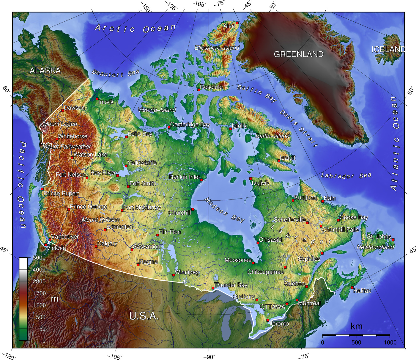
http://upload.wikimedia.org/wikipedia/commons/d/d7/Canada_topo.jpg

This is a Topographic map of Canada. This map uses color and shadows to show the elevation changes within Canada. It makes it very easy to see mountain ranges and plains within Canada. It represents elevation heights of physical land. This is a map due to the fact that it can be used by people who maybe mountain climbing or just want to learn more information about Canada and how societies have adapted to their environment. This is very great for those who want to learn more about the areas geographic features which makes this an important map.
Enjoy!

Chloropleth map


http://www.china-profile.com/data/maps/s_map_internet.jpg

This is a chloropleth map that uses colors to indicate the internet usage within China. The noticeable trend in this map is the extensive internet usage is on the eastern side of China within some of the bigger cities. The red colors indicate more usage and the green colors indicate less usage. There is also a quantified number beside each of the colors and cities which shows the internet usage within China.

Enjoy!!

Graduated Color map

http://www.bestcountryreports.com/media/D_Images/India_Temp.jpg

This is a map of India that demonstrates color graduation based on Average Temperature in different regions the red regions are the very hot areas and the blue regions are the cool areas. As you can see majority of India is very hot. This is a map that represents temperature. Temperature is something that can only be felt but it is represented well visually in this map by the use of varying colors.

Enjoy!!

Chloropleth map

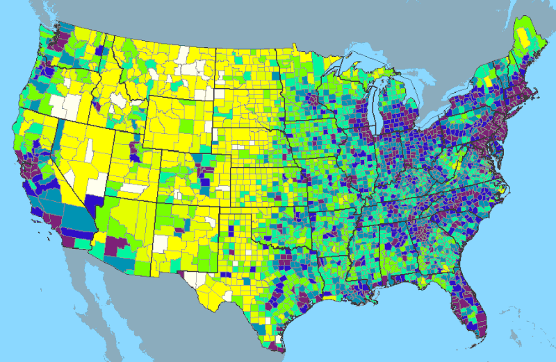
File:USA-2000-population-density.gifhttp://en.wikipedia.org/wiki/File:USA-2000-population-density.

I decided to do another population density map but this time I am doing it on the entire United States. With this map the population density isn't represneted by points but by graduated colors. It is assigned different colors by county then it is assigned a color based on that county. This is another example of GIS in motion here. The data that is being mapped out and made tangible is population density. this is a Chloropleth map because it has designated geometrical shapes and each value is represented by a color.

Dot Density map

http://txsdc.utsa.edu/maps/thematic/Pop_Density_BlkGrp2000.jpg

This is a map that displays population density within Texas using ArcGIS. I can tell that this was ArcGIS based on the legend and the font on this map. This also have the different counties within Texas and shows what county has the most population density. This is a point density map where there are dots that represent each population and representing 100 people. One dot represents a hundred people. This is a map where more dots represent a higher value.
Enjoy