This is an example of a star plot. A star plot represents multivariate data in the form of a star. Each star is representative of a single data set. In this case each star represents a different car model. Enjoy!!!
Wednesday, July 20, 2011
Star plot
This is an example of a star plot. A star plot represents multivariate data in the form of a star. Each star is representative of a single data set. In this case each star represents a different car model. Enjoy!!!
Correlation Matrix
 http://yin.che.wisc.edu/images.htm
This is a correlation matrix of proteins. This is a matrix giving correlations between all pairs of data sets. In this specific case this is showing correlations between different proteins. Enjoy!!!
Similarity Matrix
 http://cbrg.ethz.ch/Server/ServerBooklet/section2_14.html
This is a similarity matrix. A similarity matrix is a matrix of scores that shows the similarity between two data points. This maps out data and how they are similar to each other. This specific graph is an amino acid similarity matrix. This is showing the amount of similarity between different elements. enjoy!!
Stem and leaf plot
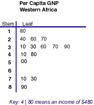 http://mainland.cctt.org/mathsummer/JosephBond/StemAndPlots/stem-and-leaf_std.htm
This is a stem and leaf plot. It is a quantitative way of representing data. It uses a number group such as tens hundreds thousands and so forth and maps out how many numbers occur in each group of numbers. In this plot this is a plot of per capita GNP of western Africa.
Box plot
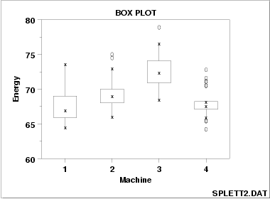 http://itl.nist.gov/div898/handbook/eda/section3/boxplot.htm
This is a box plot. A box plot graphs are graphs that uses the five number properties which are the smallest value, lower quartile, median, upper quartile, and the highest value. Here there is a comparison of 4 different machines where they use the box plot to represent the data found on every trial run of each machine. Enjoy!!
Histogram
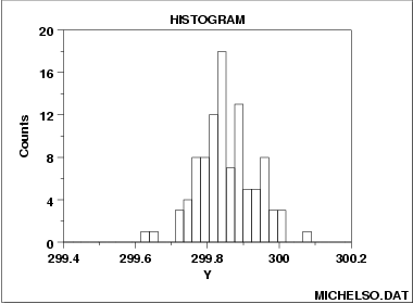 http://itl.nist.gov/div898/handbook/eda/section3/histogra.htm
This is a histogram chart. A histogram chart is a chart that uses the number of times a certain result appears and places that count in a bin and uses a bar to represent the number of times a piece of data occurred. In this particular graph there were a lot of data that occurred in the 299.8 range. Enjoy!!
Parallel Coordinate Graph
 http://www.stat.columbia.edu/~cook/movabletype/mlm/mdg1.png
This is a parallel coordinate graph. A parallel coordinate graph is a graph where it compares mulivariate data to one another on a graph. In this graph, the data is moving across the x coordinate of the graph and is giving different values of y. Enjoy!!
Subscribe to:
Posts (Atom)