 http://personalpages.manchester.ac.uk/staff/m.dodge/cybergeography/atlas/mids_af_i_gr_c_large.gif
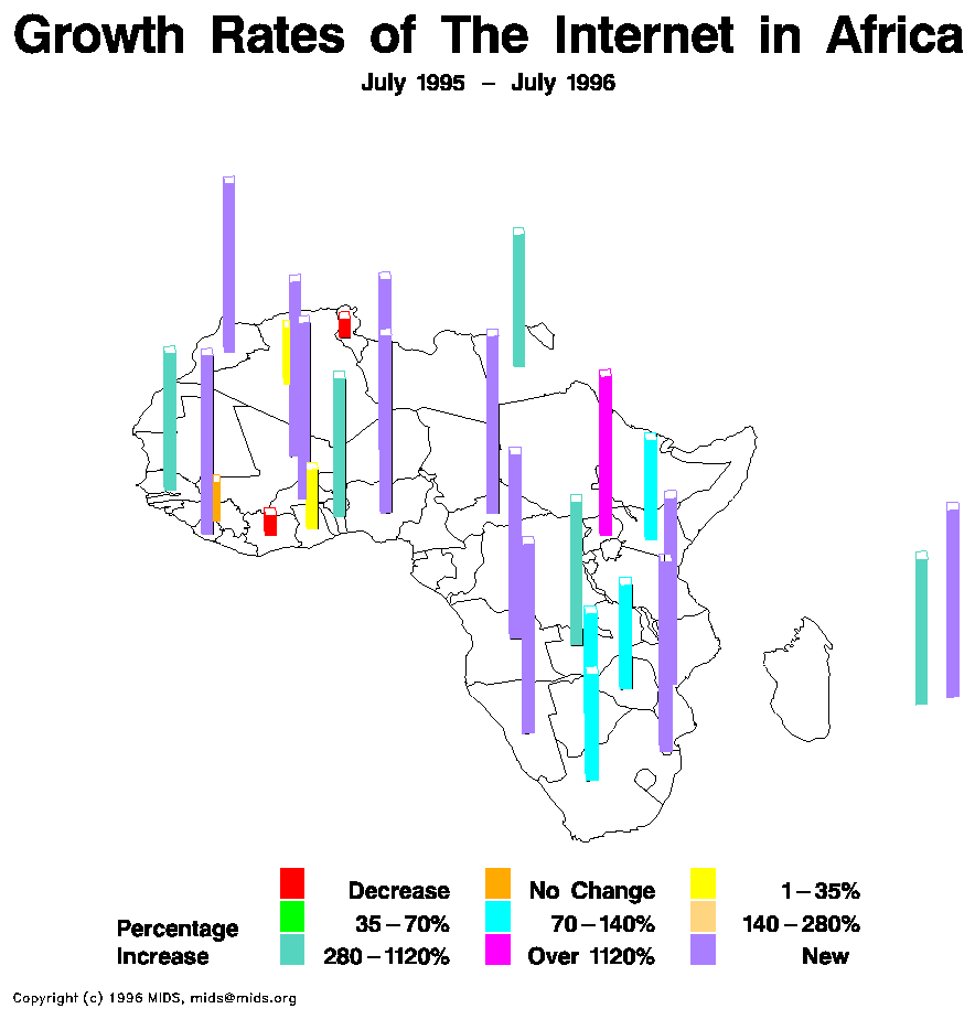
This is a map of internet usage in the continent of Africa. This shows the percent growth of the internet between the years of 1995-1996. Notice that there are a lot of countries that were just getting internet within the year. The country with the highest change happen to be the smallest spatial country in Africa. This could be due to the limited amount of people living within the country. This is a statistical map because it shows statistics. Enjoy!!!
No comments:
Post a Comment