 http://en.wikipedia.org/wiki/File:USA-2000-population-density.
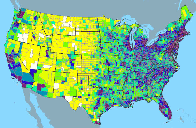
I decided to do another population density map but this time I am doing it on the entire United States. With this map the population density isn't represneted by points but by graduated colors. It is assigned different colors by county then it is assigned a color based on that county. This is another example of GIS in motion here. The data that is being mapped out and made tangible is population density. this is a Chloropleth map because it has designated geometrical shapes and each value is represented by a color.
No comments:
Post a Comment